
Have you ever noticed why we often stop at websites that fascinate and attract us even though we are not particularly looking to purchase that particular thing that we have been scrolling for a while now? Most of the time, it is because of the color psychology in web design that brands use to grab our attention.
Colors are powerful in capturing human attention rather than just being used as a design and decorative element. Understanding colors that appeal to a particular market is essential for any business niche.
Applying the principles of color psychology in web design is not just a creative choice but a strategic one. It’s as vital as selecting fonts, crafting marketing content, and optimizing for SEO. By leveraging the power of color, you can establish a strong market presence, evoke specific emotions, and ultimately drive conversions on your website.
Color Psychology 101- How Color Psychology in Web Design Can Boost Conversions
As a web designer, you must understand the power of colors and know how color psychology in web design can increase conversions, extending your online presence to the global market.
This guide will explain how to use color psychology for web design by mentioning every element to help you understand color psychology in web designs. Thus, you can play around with color psychology strategically in no time!
Step 1. Understand The Brand’s or Client’s Objective
Color psychology is an art that only a few people or brands can master. It is the study of how colors affect our emotions and behaviors. Moreover, it is a distinct field that works in various ways, from marketing and design to fashion and therapy.
When designing a website, you must align colors with your brand message and the emotions you want your visitors to experience. Let’s break it down for a better understanding:
Your Target Audience:
Think about your target audience and the emotions you desire to evoke. For example, a website selling luxury watches might use a sophisticated black and gold scheme, while a daycare center might benefit from bright and cheerful colors.
Accessibility:
Your color choices should provide enough contrast for people with visual impairments. The text should be effortlessly readable against the backdrop color.
Now that you have established the foundation for your website, let’s move to step 2, which will help you understand colors and their associations with different emotions.
Step 2. Create the Right Mood
Let’s have a look at some common colors and their associated meanings:
Warm Colors (Red, Orange, Yellow, Brown):
These colors evoke feelings of:
- Energy
- Strength or empowerment
- Urgency
- Excitement
- Passion
- Warmth
Take an example of Red color’s association with love and stop signs and yellow’s sunshine cheerfulness.
Cool Colors (Blue, Green, Purple, Black, Pink)
Cool colors tend to be:
- Calming
- Relaxing
- Peaceful
- Trustworthy
Blue is often associated with productivity; on the other hand, green represents nature and growth.
Apart from these colors, you already know you can mix colors and create different hues and shades as a web designer. Make sure to choose tones that are gentle for visitors.
Step 3. Choose the Right Color For A Call To Action Button:
The most important element is the call-to-action button when you are looking to boost your website conversion. You need to use brighter colors. Red or orange CTAs can perform well for immediate action, while blue or green can work for softer conversions.
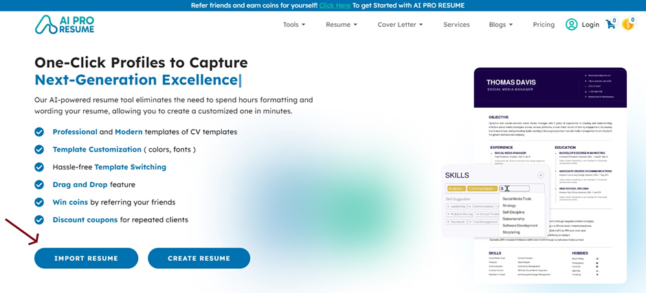
Take an example of this AI Pro Resume platform. The Company has used a hue of blue for softer conversion.
On the other hand, for a Call to action button, they opt for a more vibrant and brighter blue. However, this is just one example of how you can keep the same color that goes with the website’s layout but still adhere to the rules of making a perfect website that boosts conversions.
Step 4. Balance Of Colors
Using too many “hot” colors, like pink, can overwhelm users, so it should be balanced with lighter elements such as secondary colors or neutral accents for a clean and professional look.
Thus, you must follow a common rule of thumb when balancing website design. You need to use:
- 60% of the color scheme to the background
- 30% to the base color (header, footer, etc.)
- 10% to the accent color (CTA button)
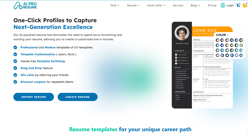
Take an example of the resume builder website. Notice the variety of shades and hues of blue with the contrast of the yellow pop-up. These are some intricacies that every website designer must follow when building a website. It looks balanced, as it is not harsh to look at, and the text is readable.
Step 5- Brand Identity Reinforcement
“According to various online studies, colors influence 60-80% of clients’ buying decisions.”
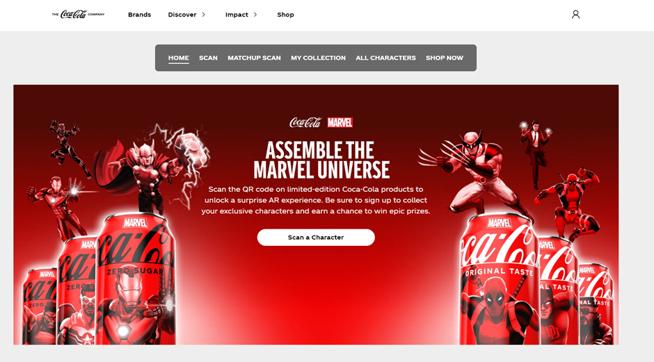
Colors become synonymous with brands. Think of the instant recognition triggered by Coca-Cola’s red or Tiffany’s blue.
Therefore, when designing a website, opt for a consistent color scheme across all your website and marketing materials. This step will strengthen your brand identity and build trust.
Moving on, you must know how successful international brands use colors that now represent them. Color psychology web design to convey their message and brand identity, which has helped boost conversions in the long run.
Brand And Color Magic
1- Red
Usage: Grabbing attention, call-to-action buttons, promoting sales
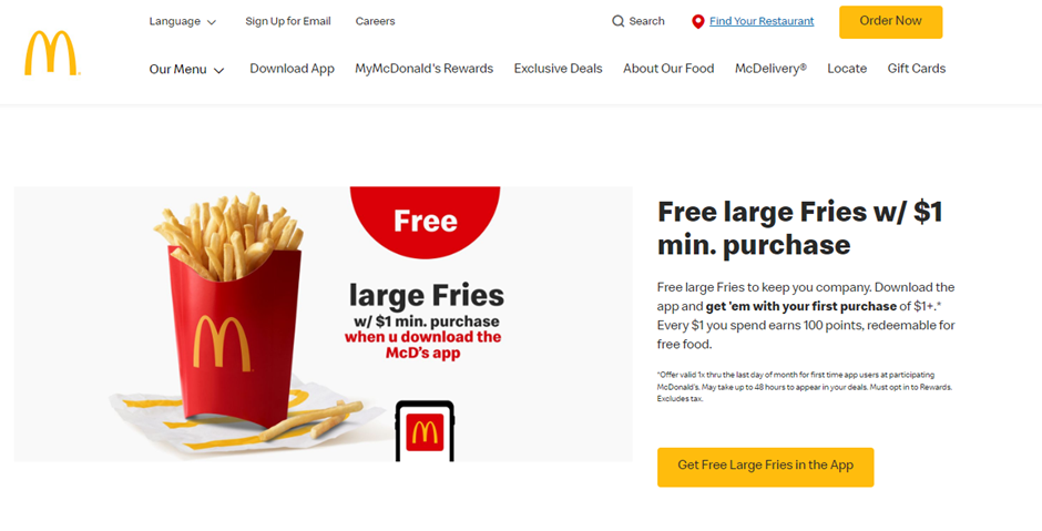
Red catches the eye and grabs attention. Fast food chains like McDonald’s and KFC use red to stimulate appetites and encourage impulse purchases. Red can also represent luxury, which is why high-end brands like Ferrari and Valentino incorporate it.
2- Blue
Usage: Building trust, conveying reliability, creating a calming atmosphere
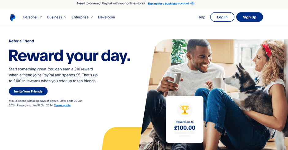
Blue is associated with trust, security, and peace. Financial institutions like banks and credit card companies often use blue to convey a sense of reliability. Social media platforms like Facebook and employment-focused LinkedIn use blue to create a calming and familiar atmosphere.
3- Yellow
Usage: Creating a cheerful atmosphere, conveying playfulness, highlighting warnings
Yellow is cheerful, optimistic, and grabs attention. Think of the iconic yellow arches of McDonald’s or the bright yellow taxis in New York City. School buses are often yellow to increase visibility for safety reasons, but the color also subconsciously makes children feel more comfortable.
4- Green
Usage: Promoting eco-friendly products, highlighting health benefits, creating a sense of balance
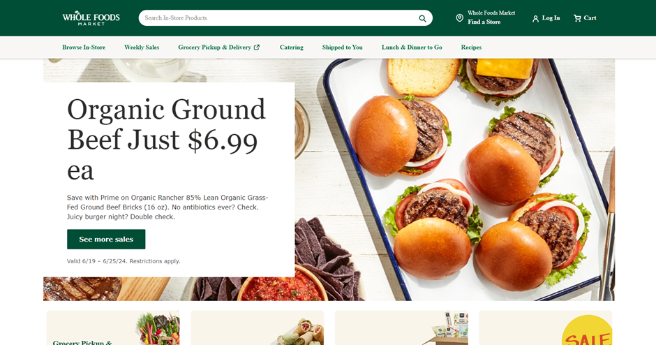
Green represents nature, growth, and health. Unsurprisingly, companies selling eco-friendly products or healthy foods prominently feature green. Think of Whole Foods, Starbucks, John Deere, and Girl Scouts, letting customers know they focus on the environment’s well-being.
5- Orange
Usage: Creating a sense of fun, attracting attention, promoting special offers
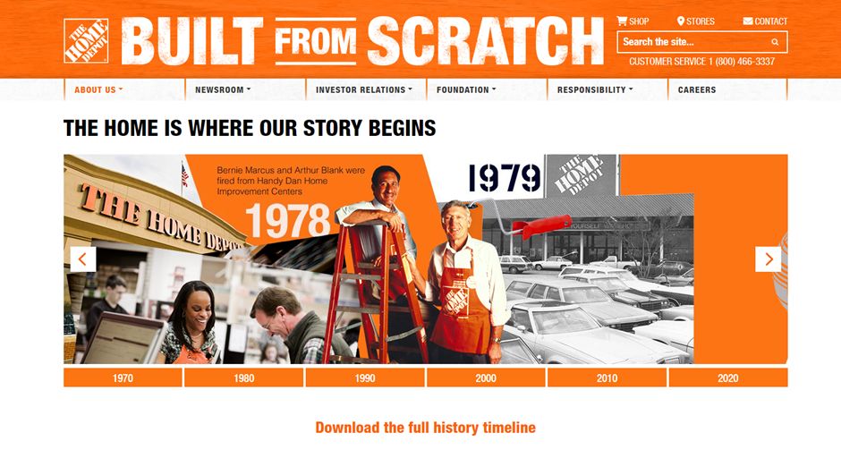
Orange is associated with energy, morale, warmth, and affordability. Think about brands like Amazon or Home Depot that use bright orange. It reflects their brand identity, conveying energy, confidence, and a sense of approachability, aligning with their focus on do-it-yourself projects.
6- Pink
Usage: Appealing to a female audience, promoting sweet or playful products
Pink is often associated with playfulness, romance, femininity, and sweetness. Prominent brands like Barbie use vibrant pink as their primary color, perfectly aligned with their brand, target young girls, and embody fun and playfulness.
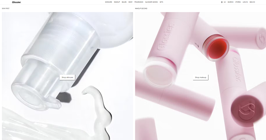
Another well-known brand, Glossier, a popular makeup brand, uses a light millennial pink throughout its website. This shade creates a sense of softness, femininity, and approachability, perfectly aligning with their brand image.
7- Purple
Usage: Conveying luxury, targeting a feminine audience, sparking intrigue
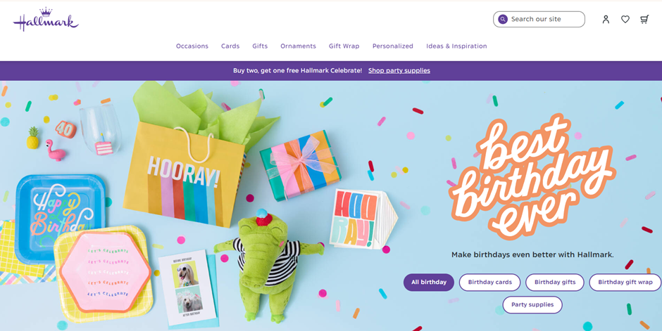
Purple is a color linked with Royalty, luxury, creativity, and mystery. Thus, well-known websites like Hallmark use sophisticated purple throughout their websites, reflecting the elegance and thoughtfulness related to their greeting cards and gifts.
8- Black

Usage: Highlighting exclusivity, creating a sleek and modern look, emphasizing text
Black presents sophistication, luxury, elegance, and power. Consider the renowned phone brand BlackBerry, which uses a black background with bold white text, creating a sleek and sophisticated feel that reflects the brand’s focus on high-end smartphones.
9- White
Usage: Creating clean and spacious layouts, emphasizing content, providing a neutral background
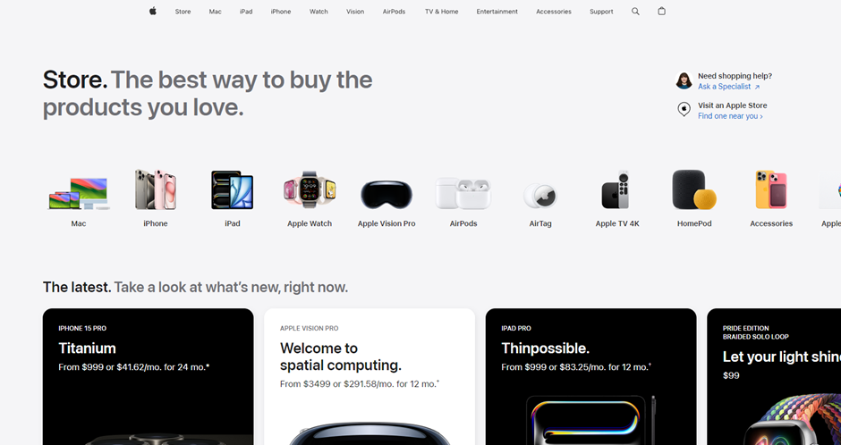
White portrays purity, cleanliness, simplicity, and minimalism. Take the example of Apple. Their website uses a white background extensively, showcasing their products with clean lines and a minimalist aesthetic.
Last But Not Least
By strategically using color psychology, you can create a website that looks good, drives conversions, and achieves your business goals. Remember all the steps in our guide to color psychology in web design examples to give website designers a better understanding of how a successful webpage should look. And remember how balanced it seems.
More importantly, researching before starting your web design is vital, so ensure your target audience is the business you’re making a website for.
Frequently Asked Questions (FAQs)
How do you benefit from color psychology in your website design?
To benefit from color psychology in web design, you must understand how to apply it strategically. You must figure out your target audience and your brand’s niche and research colors and contrasts to create visually attractive color psychology that drives user actions and achieves your website’s goals.
Why is color important in website design?
Whenever you click on a website, you see the colors first. If the colors are not professionally selected and look dull or harshly vibrant, they won’t attract visitors, ultimately making them leave your platform. Thus, it is important to choose balanced colors.
What color attracts people to a website?
The color that attracts people to a website can depend on the website’s content and target audience. However, most people favor colors like blue, purple, green, and secondary or neutral tones because of their calming effects.